StarCraft 2 Melee Map Contest

River City
If you would like to upload this map with in a different locale or with different modifications, please message me in game or e-mail me first.


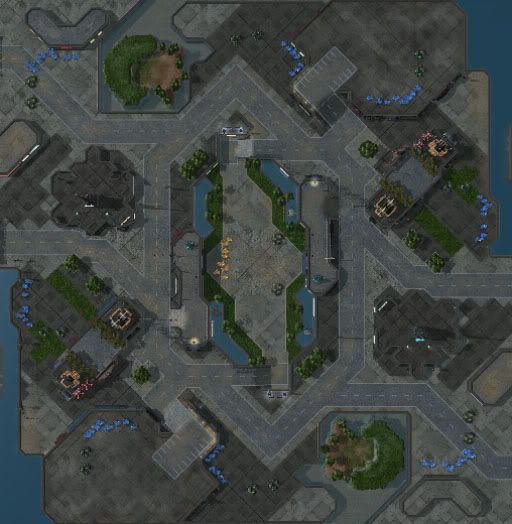
1v1 Standard Melee map. Brawl downtown, and be sure to grab a watchtower in the center of the map. The gold expansion in the middle is key to staying on the offensive.
- Author:
- StaRelentless 1
- Players:
- 2
- Dimensions:
- 160x136
Review this Entry
You must log in to review contest entries.
very nice design. a moderate amount of doodads (not crowded) i agree on the ramp issue
The map is quite small, with short rush distances and larger-than-average main ramps, which makes 'cheese' strategies very powerful. The natural is very, very open and almost impossible to defend. The mineral locations at the naturals are also placed very strangely.
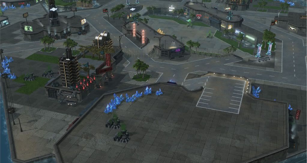
The map also seems to look a bit too clean, and lacks a sense of atmosphere. The islands in the northwest and southeast also don't fit well with the theme of the map. It looks sort of unfinished.
However, the basic layout of the map and the size and shape of the attack routes have potential.
Cool city setting map. The watchtowers overlooking the High Yield are nice.
The mineral patches right near the edge are in a bad spot to be abused by lots of cheese rushes. Reapers/Cannons/Tanks there would be devastating early on.
Very beautifully made map, love the details.